Type Checking the Inequality Debate
Facts are meaningless. You can use facts to prove anything that’s even remotely true!
—Homer J. Simpson
I’ve already thrown in my two cents on the central theory in Thomas Piketty’s Capital in the 21st Century. But I think (again, not having actually read the book) that the legacy of Capital will not be its theory or its policy prescriptions, but how it has shaped the debate on inequality. In the past, even as recently as the Occupy Wall Street movement of a few years ago, ideology took center stage. Piketty’s rise to stardom has put the spotlight on data.
On the one hand, this is a terrific development. Ideological debates are intractable, while data can, in principle, be viewed and discussed in an objective manner. But data analysis has its own pitfalls, and if we’re not careful, our own ideological biases might seep into the data we choose to study and present. What we need is an expressive but strict framework with which to view data: expressive meaning we can uncover the truth hiding in the data, and strict meaning we won’t erroneously use the data to say something false. What we need, in other words, is dependent type theory.
One common theme in data cited by those on the “left” of the inequality debate is the rising gap between the top 1% (the choice of 1% being an unfortunate vestige of Occupy that should be snuffed out ASAP) and everybody else. Consider the chart below from Christopher Ingraham’s Wonkblog article, More reasons why the U.S. is the best place to be rich, which shows the income share of the top 1% rising dramatically in the United States from 1981 to 2012. Can you spot the type error?
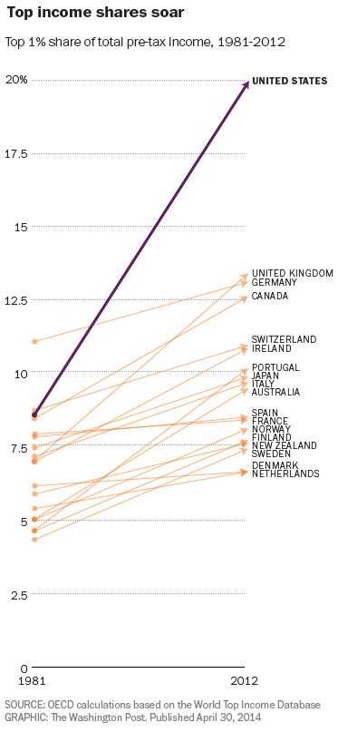
Did you find it? No? Well, let’s consider the dependent variable here. In order for a chart to make sense, the type of the dependent variable needs to be constant: it can’t depend itself depend on the independent variable (in this case, time). This is, for instance, why we need to choose a particular year to discount to in charts of dollars vs time: in general, the type of money depends on time!
The problem in this chart is a bit more subtle: the people who comprise the top 1% change over time. This is not merely a technical consideration. You can easily imagine a society with a high level of mobility in which people routinely rotate in and out of the top 1%. In such a society, is a chart like the one above really indicative of any problem? While we aren’t quite at that level of mobility, Thomas A. Hirschl and Mark R. Rank found that 12% of Americans are in the top 1% for at least one year, and 73% are in the top 20%. This dynamic view of income distribution is made completely invisible by Ingraham’s chart.
So, Ingraham’s chart fails my internal type checker, and in my opinion, such charts should not exist. Don’t get me wrong: I think inequality is a huge problem (albeit much more so on the global level than domestically). But it serves no one to make misleading presentations of data. Often the desire to be righteous blinds us to the virtues of being right. Until we have a system that can automatically type check our data analyses and presentations, we need to be extra vigilant ourselves to make sure that what we’re doing with data actually makes sense. Friends don’t let friends make type errors. So be a mensch: type check your friends, not just your enemies.